
TripIt for iPhone
I love TripIt.
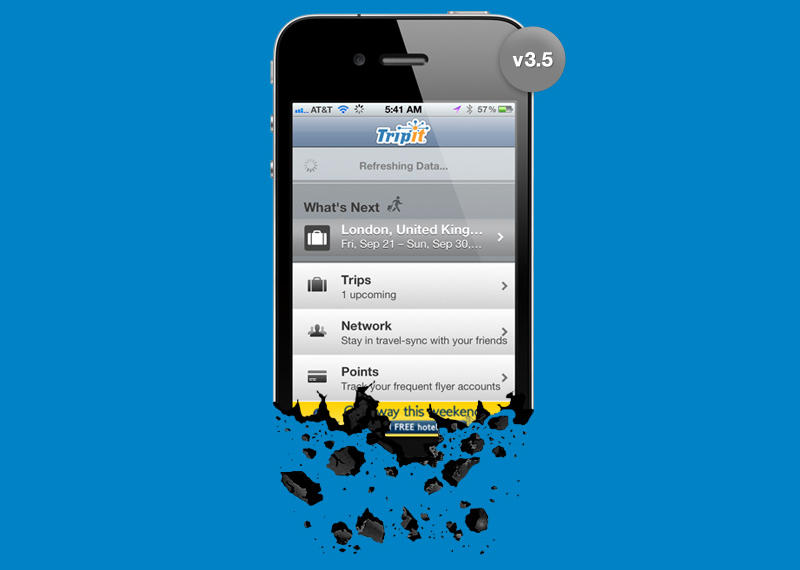
I travel a lot, and I use it for all of my planning. The iPhone app, however, drives me nuts. It's slow, hangs on refresh at every launch, and buries crucial information. Assets aren't in retina resolution. Performance degrades from just seconds of use. And the UI is just... muddy.
So I took a shot at iterating the current version (to lessen the shock for existing users) and developing a product road map towards a bolder, better UX for delivering TripIt's awesome tech. Here are a few of the lessons I learned from a few dozen of my own iterations.
Itinerary Apps are Hard.
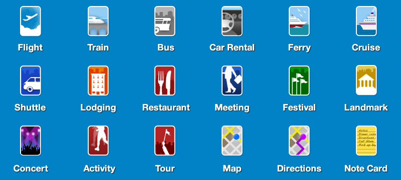
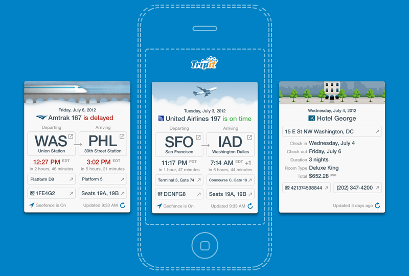
Their density is impossible to appreciate until you map them out. A 3.5" screen seems tiny when you're sorting so much urgent information for flight with multiple layovers, or a complex train route. Each "waypoint" has a unique data set, and TripIt sorts over 15 types of waypoints: flights, trains, buses, car rentals, ferries, and so on.
Packaging each waypoint's data into a single "card," with a unique layout, is one way to visually distill what's most important. Each card feels finite and manageable, regardless of its size.
Lighten Up.
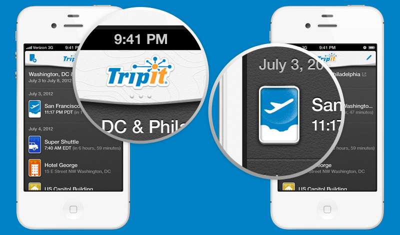
The current TripIt app, v3.5, is bland. Lifeless. "Default." It doesn't tell me anything about the TripIt brand, or its creators' passions. It doesn't convey the adventure of travel. So I designed a fresh view around one of my favorite travel settings: a Virgin America airline seat, with clean moulded surfaces, porthole icons, and a grey leather back.
(Your experience with airline seats may vary.)
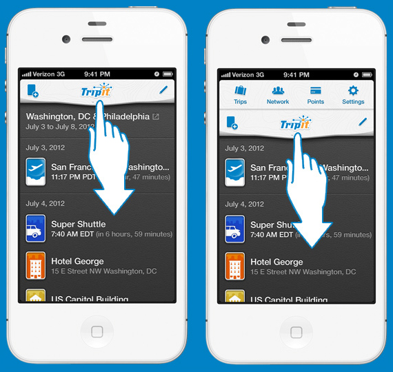
Menus are Temporary.
In TripIt 3.5, the Home screen is just a redundant menu. When moved to a slide-down tray at the top, you can jump between sections more quickly. Plus, you're rarely more than two taps and a swipe away from any waypoint.
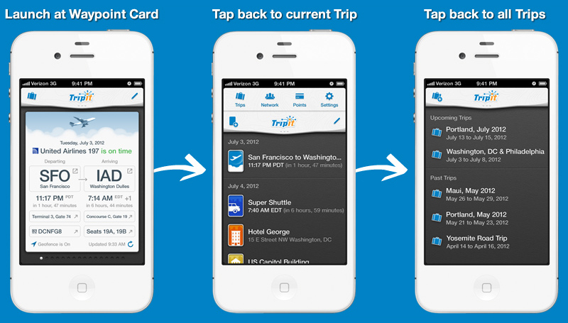
Minimize Input, Maximize Output.
It's a basic principle of interaction, and nowhere is it more necessary than for users in motion. TripIt 3.5 is structured from menus at the top, to waypoints at the bottom. That's backwards. When you're traveling, TripIt should always launch on the waypoint happening now. This reduces the most common user story from multiple inputs, down to one: tapping the app icon, or swiping a push notification.
Go Ahead. Share Your Brand's Feelings.
Each type of waypoint card features unique artwork, which could also be animated with subtle loops. No matter the status of your plane, train, or automobile, at least TripIt will make you feel like you're going places.
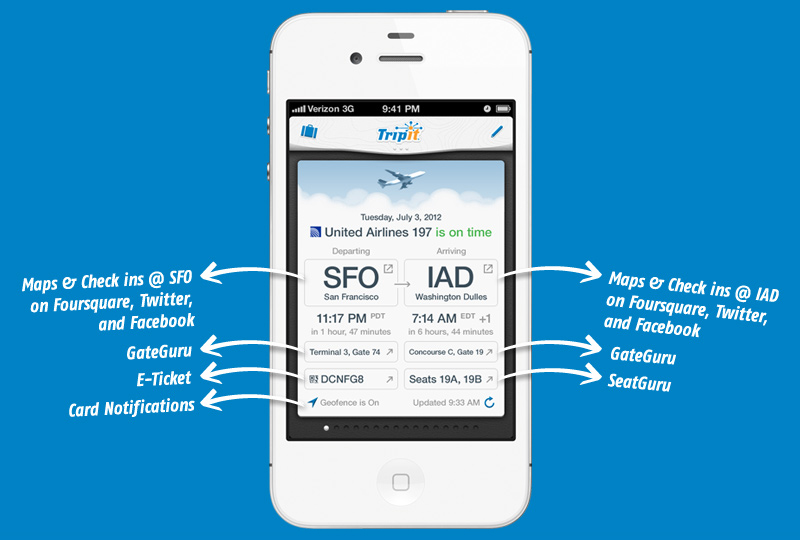
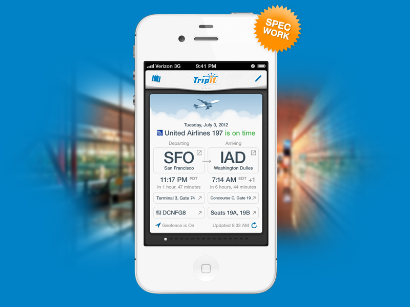
Focus on Clarity of Data.
Travel involves inescapable loads of information. TripIt handles over 30 data points for flights alone. In this iteration, a flight card shows the most important 15 pieces of information above the fold, and 17 pieces below it. A dozen buttons link to other services. This iteration is still very busy, but more could be moved below the fold of a scrolling card.
When launching cards, TripIt should always load your cached data first. Auto-update the urgent waypoints, like an upcoming flight's status, and skip static waypoints, like restaurant reservations. If you need more, you can always tap to refresh manually.
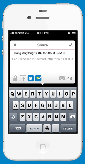
Encourage In-app Sharing.
TripIt is not a social LBS (yet?), but when social APIs are so ubiquitous and intertwined, you shouldn't need to jump out of TripIt just to check in somewhere. Tapping a location in TripIt, like an airport code, can reveal a simple sharing window where you can check in on Foursquare, Twitter, and Facebook, simultaneously. Or, to keep a check-in private, just tap the lock.
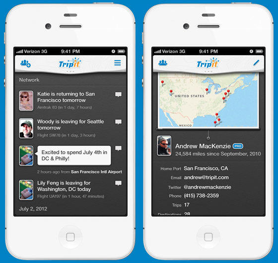
Build Smarter Networking.
Naturally, both your activity and check-ins appear in your TripIt Network timeline and profile, along with the upcoming waypoints of you and your contacts. TripIt could be one of the few social/business networks to intelligently map future events, in addition to the present and the past.
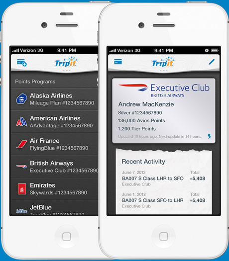
Push Premium Services, Gracefully.
Frequent flyer accounts would be retained, but with new interfaces that respect providers' brands. Users wouldn't be bombarded with banner ads to upgrade to TripIt Pro. Premium sections would just show full-screen teasers, with an upgrade button at the top. Also, this section need not be limited to points programs. TripIt could use this space to promote premium content and service partnerships with each user's preferred travel providers. Except for Southwest. Apparently they're jerks.

Dare Greater, by Iteration.
There's so much more that TripIt can do with travel data, like premium co-support and service partnerships, aggregated (and anonymized) traveler statistics and reports, and many others I can't fully illustrate here. First and foremost, TripIt should always focus on speed and clarity — show the most important cached items first, and refresh in non-obtrusive ways. I'm eagerly awaiting the next update.
Created September 2012
Other Recent Work


© 2016 Andrew MacKenzie